Old Portfolio Usability
user interface + user experience

A usability study over my old portfolio site and reasons why I built a new one.
In the final semester of the program, one of the classes was called Portfolio Development, where we must use projects from past semesters and new projects from other classes in the current semester to be showcased in our portfolio. A total
of twelve projects was to be signed off and approved by two professors in the four months of the semester. Three projects had to be signed off every two weeks, and the final being our own portfolio website.
By the time I got around
in creating my portfolio, there was about two weeks for me to design and create the website. Running short on time, I knew the design that I wanted in my mind and decided to not make any mockups or did any planning in how the navigation
of the site will be. During that time, I started using different JavaScript libraries in the creation of websites. I decided to challenge myself to create my portfolio site entirely out of JavaScript libraries.
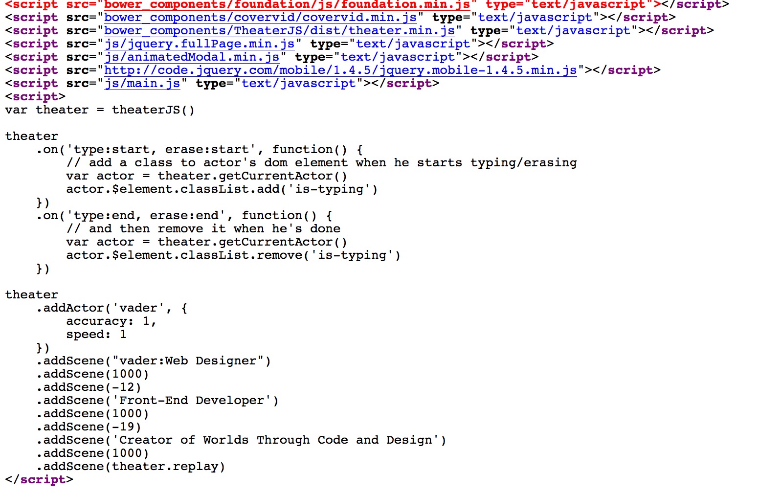
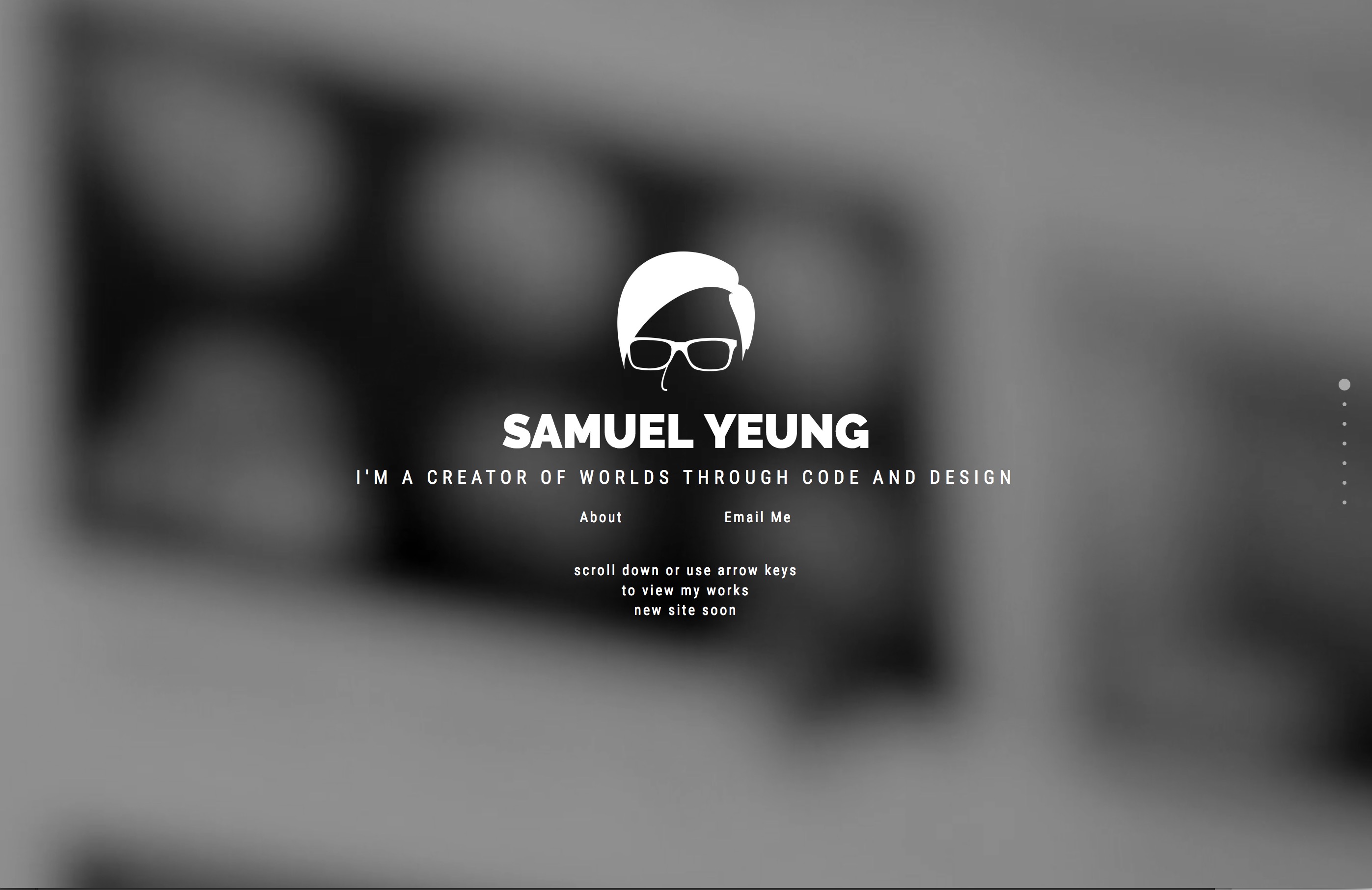
Everything in the website was using some type of JavaScript library, the full-page navigations, full width and height video, lightbox, animated modal for about information and the self-typing text animations.
My professors and my
classmates were impressed with the website but when I returned to the website after my placement, I did more researched on user experience and noticed many flaws in it.
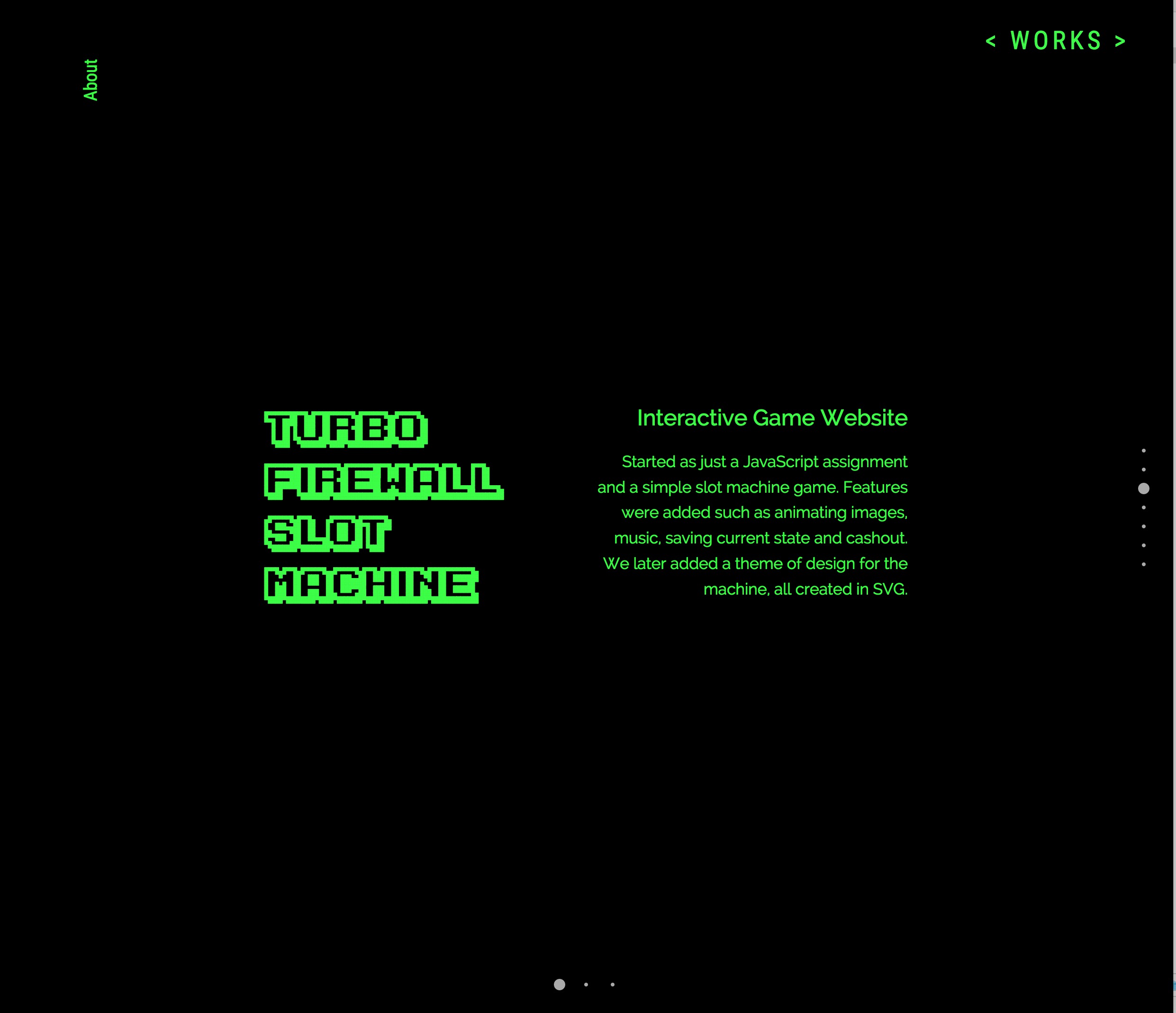
Navigation: When a user enters the site, they would have very little indication to scroll down or use the arrow keys to navigate my website. Sure, there is text that explicitly says to use it and page indicators on the side as a hint, but forcing the user to read and learn how to use the website is not a particularly good practice when it comes to onboarding. Not only that but if the user decides to scroll immediately before the website finishes loading, the full page will break. There are also little to no indications to scroll left and right on each of my project page. If the user only learned to scroll up and down from using my title page, they wouldn’t have known that they can scroll left and right. The only indicators I gave them were the arrows on the top right corner.
Responsiveness: The full-page JavaScript library was responsive and using Foundation helped with other elements on the page, but the text does not scale at smaller screen widths and therefore harder to read and important texts like how to navigate the website would not be readable. Page indicators on the side would cover up text as well. The problem was that text sizes were relative to the page width and it kept the same percentage. Since I was using a lightbox to showcase images for my projects, if the height of the browser was higher than the image, blank space was shown at the bottom, if the height was less than the image, users wouldn’t be able to see the entire image.
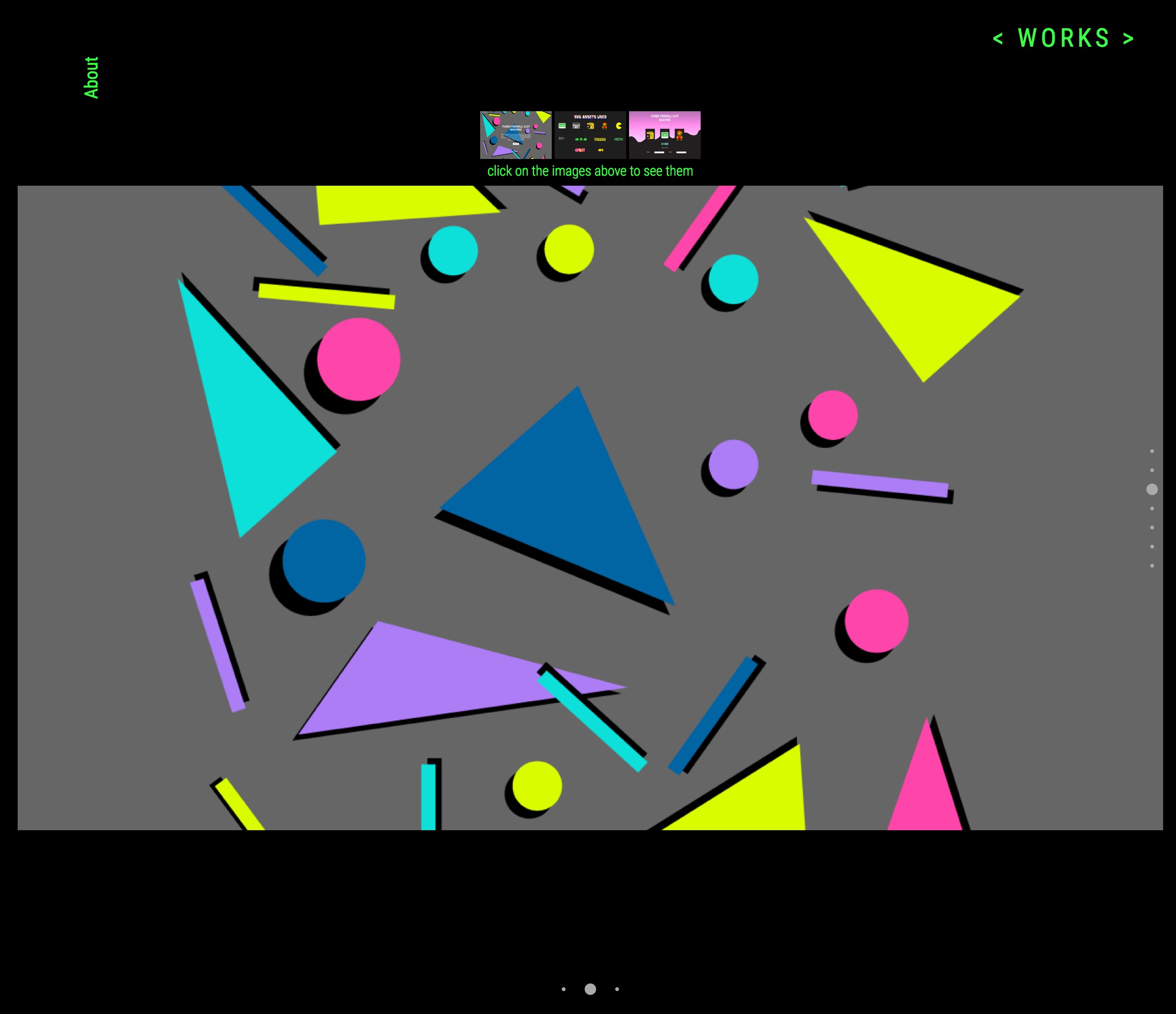
Interactions:There was no clear indications on what things can be clicked on. Other than the viewing the project at the last slide on each project page being intentional buttons. Other buttons and links like the “About” and “Email Me” links on the main page shows no clear indications that it is clickable unless the user hovers over it. This is also true for the “About” link on the top left corner on each project page. Clicking the About link will open the modal, where the button to close it is too small to be legible and there is no clear indication that the image at the bottom will open my resume.
A lot of people appreciated my old portfolio because there were a lot of character and personality to it, each page was different colours and navigating the website only reveals more information. The short fall was that no one can appreciate the website if they didn’t know how to use the website in the first place. It was clear that I did not planned how I would want to execute and showcase my projects in a manner that was easy for people to find. By not spending the time to think about the purpose of each intentional design decision, I created something that might look good but fundamentally flawed.
Knowing all the shortcomings of my old portfolio, I realized that if employers had to sift through so many portfolio and resumes, they simply wouldn’t have the patience or time to figure out how to navigate my own site and would simply move
on to another candidate. It was clear by then that a new website was needed.
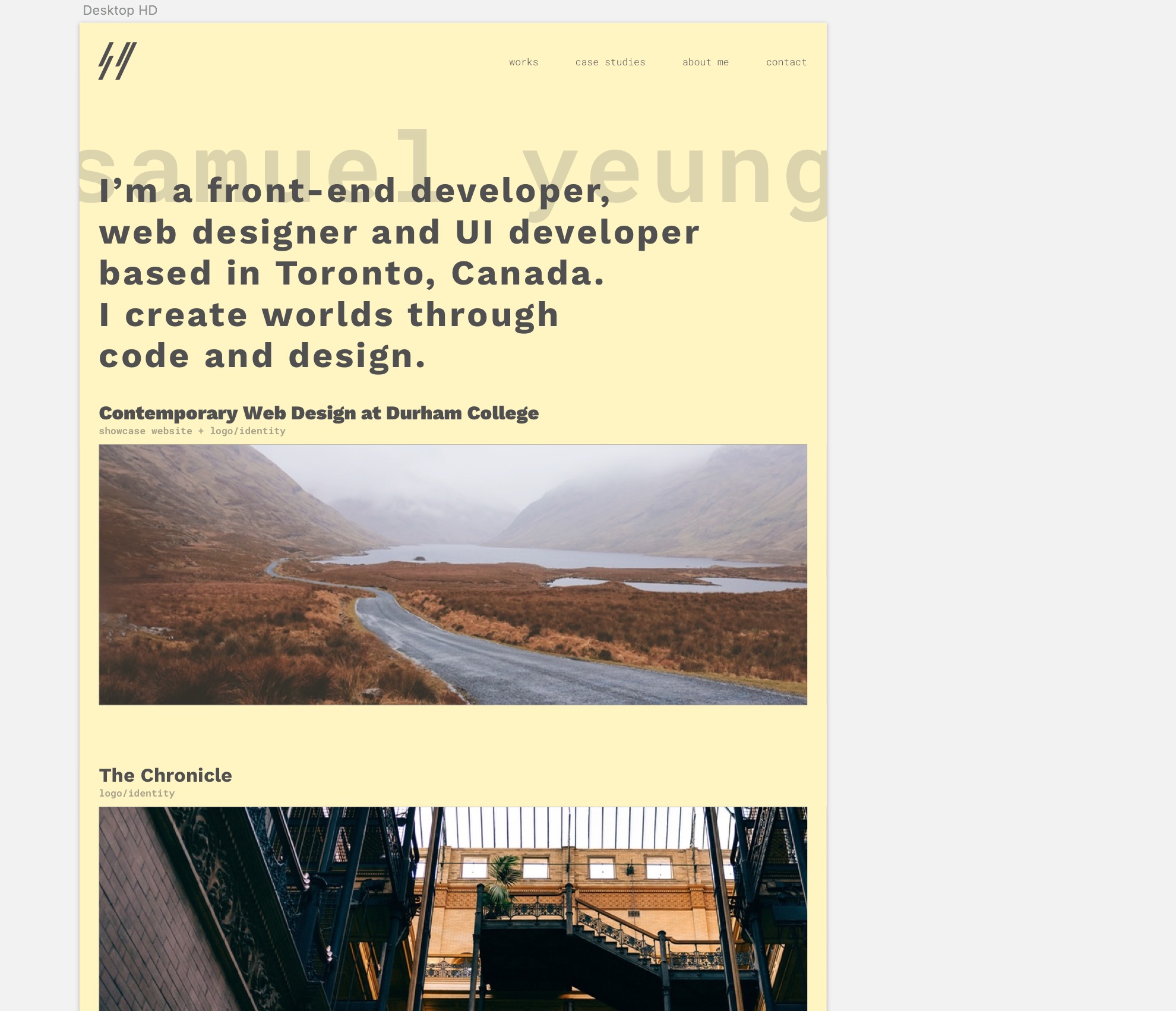
To make sure I don’t repeat the same mistakes this time, I started with mock ups, and figuring out colours and typography early as well. I also decided
to use a grid system to sort my content, as this is more familiar to users. I avoided any type of left and right scrolling, and any hamburger menus as it would hide vital navigation. I also didn’t want to make everything in one page even
thought that is a popular trend, I didn’t want the user to over scroll or scroll so much to find a specific projects or content. I also decide to make visual cues on what can be clicked, such as making links with white backgrounds or hover
with white backgrounds.
I still wanted to put my own personality and style in it without sacrificing usability as well. I loved the typing text animation and I kept it in my new portfolio. I also wanted to give cues for users to
know what page they were in and therefore I created a large text on the page title across the header of each page.
After the mockups, I had to determine how to come up a solution in building the website. I could’ve used a CSS framework that I was familiar with like Foundation or Bootstrap, but to increase performance and lower loading times, I decided
to work with Flexbox, even if it wasn’t supported by Internet Explorer.
Somethings I created in mockup didn’t end up in production, for example I originally I created different colours for my own branding, four for background colour
and another four for text, making a total of sixteen different colour combinations. But most of them failed to pass contrast tests and therefore I scrapped the four text colours and therefore there are only four colours that would change
every time a page is loaded. I originally placed project texts above the images but people usually associate the text with the image if the text was below the image. I added descriptions for each project, since I felt that without one
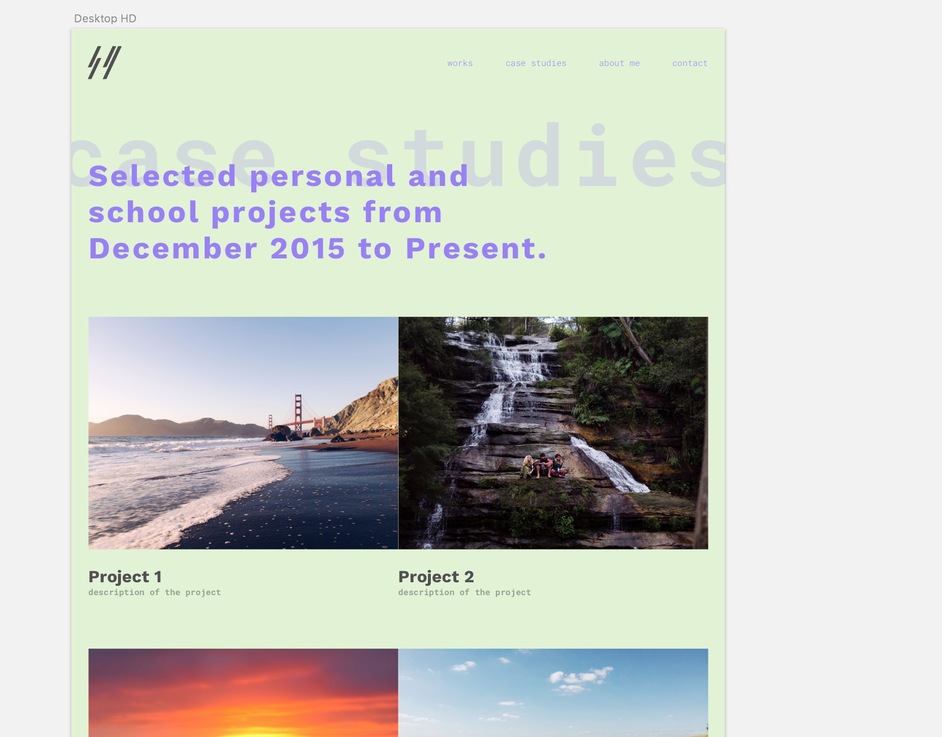
it didn’t give enough incentive for the user to find out more about each project. The school project page was supposed to be a grid of images but after adding descriptions, content felt too close together in smaller screen sizes, therefore
an alternating image and text was used for desktop and a simple top down content for smaller screens. Each project page has links to the next and previous project and therefore avoids users to go back to the main page to view the next
project.
Throughout the entire building of the website, I constantly made sure that the same experience can be felt no matter what type of screen size the user might have and what browser they might use
I also understand that there are still lots of room for improvement as well, user testing would be something I would explore in the future as well to make sure that the psychology of all the content being sorted and hierarchy of text is seen consistently with all users. In the meantime, I know that I did a great job and set a good foundation for future changes and a step in the right directions.
Deliverable: user interface + user experience
Project: Old Portfolio Case Study
Applications Used: Sketch
Technology Used: HTML5, CSS3, jQuery, Flexbox
Contemporary Web Design is a program offered at Durham College.