The Chronicle
logo/identity
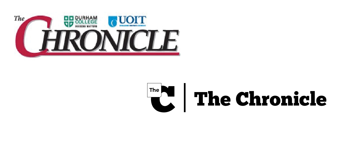

A design competition against Graphic Design students as well as other Web Design classmates in creating a logo for The Chonicle, a student run newspaper for Durham College.
We were given two weeks to come up with several designs before
presenting with two
When staff members of the newspaper they presented some goals and an insight of the newspaper. They outlined their purpose and mission statements of the newspaper and as well as other school newspaper from other colleges and universities. Before I sent out to do any design work or research, I read through all the statements and made out key words. They mentioned that they want to present The Chronicle with four attributes: Contemporary, Grabby, Engaging and Fresh.
When it comes to logo works, making designs to current trends are ill advised. Logos are supposed to last at least for ten years, and therefore I need to design a logo that should be simple but as well stand the test of time. It was also supposed to be printed on newspaper and as well as displayed in digital formats, that means I needed to make sure that how small or big the logo is, it should be easily recognizable.
I spent the first weekend exclusively working on making a logo, after Sunday night, unsatisfied with all the mockups and sketches I made, I asked my roommate when he thinks of newspaper, what does he see. He presented this:

Using that simple icon, I set out in harmonizing the words of the name of the newspaper with the icon. I looked for more inspiration with someone I looked up to in terms of design, Dieter Rams. He outlines Ten Principles For Good Design, even though it more pertains to industrial designs, it helped me explore creative ways to use design for solutions on multiple problems. I also seek inspiration from a graphic designer called Michael Bierut, who talked about logos being an empty vessel, and pouring meaning into them. Knowing all this, I wanted to create a logo that solved other problems in the newspaper, but also aesthetically purposeful and can allow people in the team to inject meaning and create a narrative through the logo.
A type of logo was starting to become popular and that is called a logo system, a framework that will allow it to create infinite permutations of it. I decided to use this type since I recognize that purpose of news is to deliver recent or important events and this very purpose can be expressed through the logo itself. I also noticed that the newspaper was sorted in seven different categories. There was no indication on what category a reader or user would be on other than explicitly using the category word displayed on their website or newspaper. I thought that a visual indication would not only be easier for users to recognize what category they are in but also save them printing ink if they were to use these visual cues.
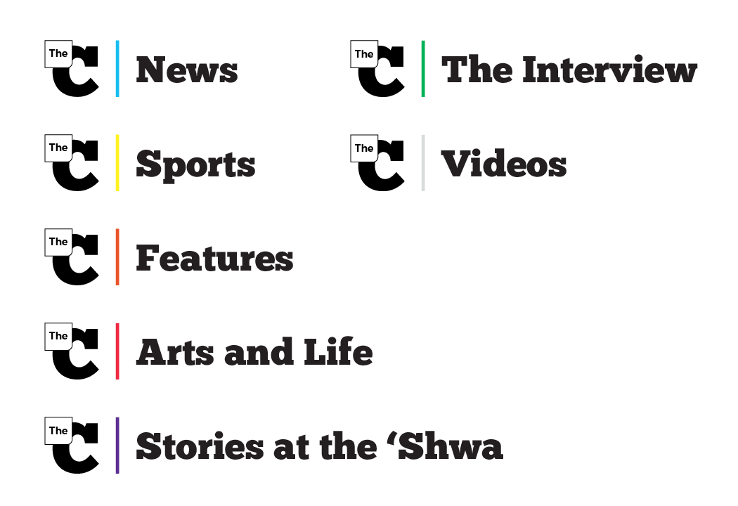
I ended up creating a logo with a big letter C, with a box on the top corner mimicking the logo icon that my roommate showed me. Initially, decided to have the letter be striped but that would have caused readability problems and as well printing problems if the ink bleed. So, a simple change to a solid colour was used. The words of the newspaper were also spelled out in full with a line separating the icon and words. The line served as a purpose when it came to indicating different category. I used a different colour for each category and applied it on the line. I purposely used colours that would not work together since they are supposed to be left by itself with no other colours.
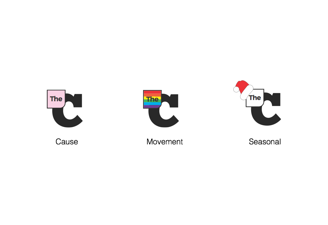
The box that housed the word “The”, severs a purpose as well, it is a box that allows future staff to create a permutation of the original logo to suit the needs of current events. Something that would always be fresh and engaging to viewers but not entirely different enough that it isn’t easily recognizable. The box could be coloured in to suit any needs for example a cause, a movement or even seasonal expression can be used.
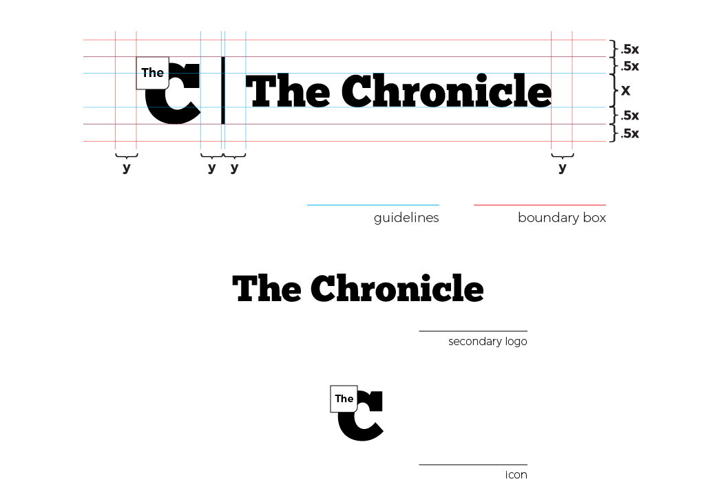
Before the I designed or settled in any of the logo, I challenged myself to create a brand book in the designs I made. It was completely not required but I recognized that it was a good challenge for myself to create something that reflects real world situation. At the end I created a twelve page brand book highlighting the purpose and intentions of the logo, logo integrity with guidelines and boundary box, acceptable and unacceptable uses, color usage, typography and application mockups.
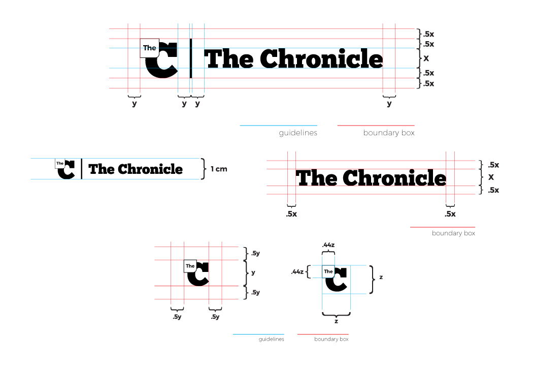
The Chronicle staff spent the next three months looking over all the logos proposed, unfortunately my proposal was not the final one chosen but I was in the top three beating out most of the graphic design students.
Deliverable:logo/identity
Project: The Chronicle
Applications Used: Illustrator
The Chonicle is created and produced by students of the journalism program at Durham College. News are communicated through paper and in digital through their own website.