Logos / Branding
The challenge was creating a logo and branding that can adapt to the program as changes over time. The staff changes subjects being taught in each class yearly as it adapts to the current state of web design and development trends and I want
to capture that very sense of an ever evolving and refining of the program’s mentality. The program didn’t have a previous logo and they essentially given me a blank canvas to paint on with a week to come up with mock ups.
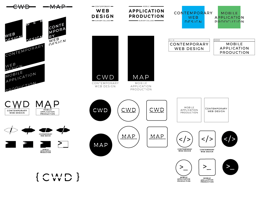
First, I used their mission statement to look for keywords that I can work with in finding ideas to where to start. Agile, Adapt and Evolve were the keywords I have picked. Most of the time was spent researching, finding what other web design
programs or related programs have in terms of marketing assets from different colleges and universities then I researched on current logo trends.
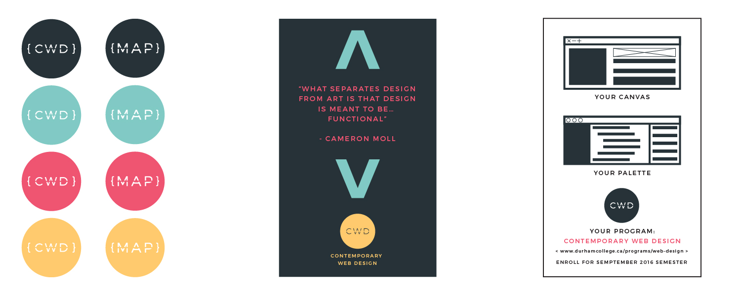
Assets were considered after the logos were done. These includes shapes, typography and colours. In terms of shapes, I used common punctuation marks in coding for example pointy brackets and forward slash used in HTML tags, semi colon used
in most programming languages and curly braces. These shapes can be used in marketing materials like posters or cards in the future. In terms of typography, I was debating if I should just use a san-serif and serif pairing or just one
san-serif font for everything, I chose latter as it would be a lot easier for the staff to create marketing materials and didn’t have to worry so much in terms of type hierarchy when juggling with two different typefaces.
I end up using Montserrat, it was free to use and using Google Fonts in loading the website would speed up performance. The first set of colours I chose were a lot of pastel colours, and it gave a more kiddy-ish feel and it didn’t feel anywhere
close to a professional colour set. There were a lot of colours too, I couldn’t decide on them so I ended up with seven colours which were far too many and it wouldn’t help the person creating marketing materials in the future.
At the end, I decided to use the same colours that I had in my text editor theme, which consists of four different colours. I also refined the shapes we were using and removed the semi colon and replaced it with square brackets therefore all
the shapes are all brackets.
The final logo was the initials of the program encompassed by a set of curly brackets and inside of a circle. There is a line that cuts directly in the middle across the text only. They are offered in all four main colours with the off black
as the main colourway. A similar logo is also made for their continuing education program called Mobile Application Production (MAP).
Designing an Interactive Website
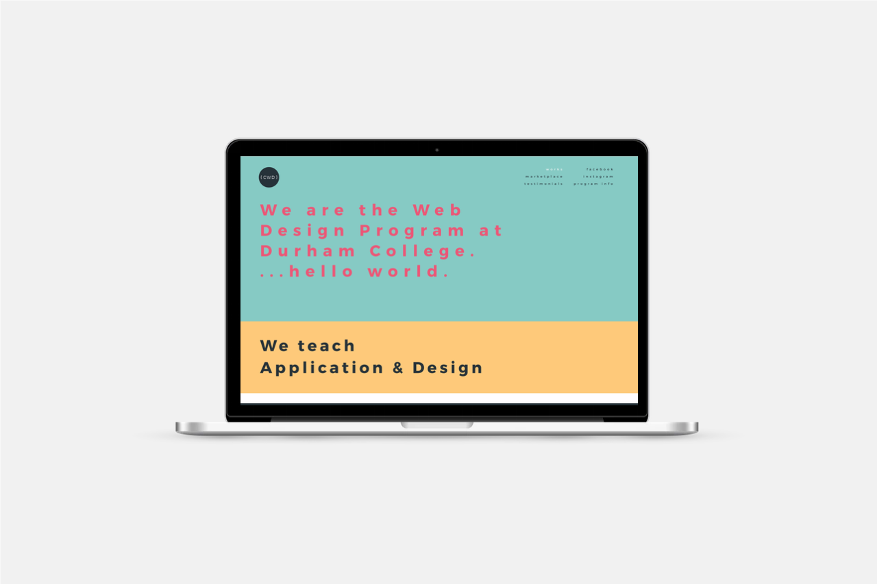
In the second week, I was tasked to make a mockup of the website for the program. I challenged myself to make the mockup from Sketch a new software that I didn’t have any prior experience in. We determined that the website should be the showcase
for student’s work would help set an idea for future or potential students to see what they will learn in the future. I was doing research and figuring out current web design trends, when I talked with my coordinator and she challenged
me to make the website more interactive.
We came up with a solution that will showcase four projects for each of two categories, Application and Design. When the user hover over the image an expanded image will be displayed in the banner image while revealing the name of the project
and the author. Each category can be expanded to reveal four more projects hidden. There are two more pages, one that is the marketplace where graduated students can showcase their current works and projects and a testimonial page.
Building / Testing the Website
The biggest challenge for me was creating this website and using the knowledge I learned from the past two years into a reality. I decided to use resources that I was familiar with and didn’t try a new method since I was short on time with
one week to build and test the site. Therefore, I used Bootstrap framework to help me with building a site that was responsive. (which looking back later, had its short comings which I will explain below)
There were a lot of jQuery functions that was used to check if the user was hovering a specific image and when to reveal or hide more images. Also, a lot of functions was used to hard check when screen width is less than a certain width and
change text sizes.
I made sure to test in all screen sizes that was available to me and as well as many browsers available. On desktop, iOS devices and Android devices, to check if content was useable and the experience was the
same throughout and across devices.
What I learned:
Working closely with my professors in creating a brand and identity that represents them and the program. Presenting and creating a presentation for my designs to a group of people and explaining my thoughts on my design decisions and thinking.
Using and learning Sketch to create mockups.
What I would do differently:
There were so many jQuery functions that it effected performance at the end. I would first ditched Foundation entirely and would use Flexbox if I knew how to use it when creating the website, this would help with performance and loading times.
Using SVG for the logos instead of .png which would future proof screen sizes and good practice in general. Using CSS media queries instead of using jQuery functions to handle text sizes at different screen widths.
Details:
Deliverable: web design + logo/identity
Project: Contemporary Web Design (CWD)
Applications Used: Illustrator, Sketch
Technology Used: HTML, CSS, JS, Foundation


