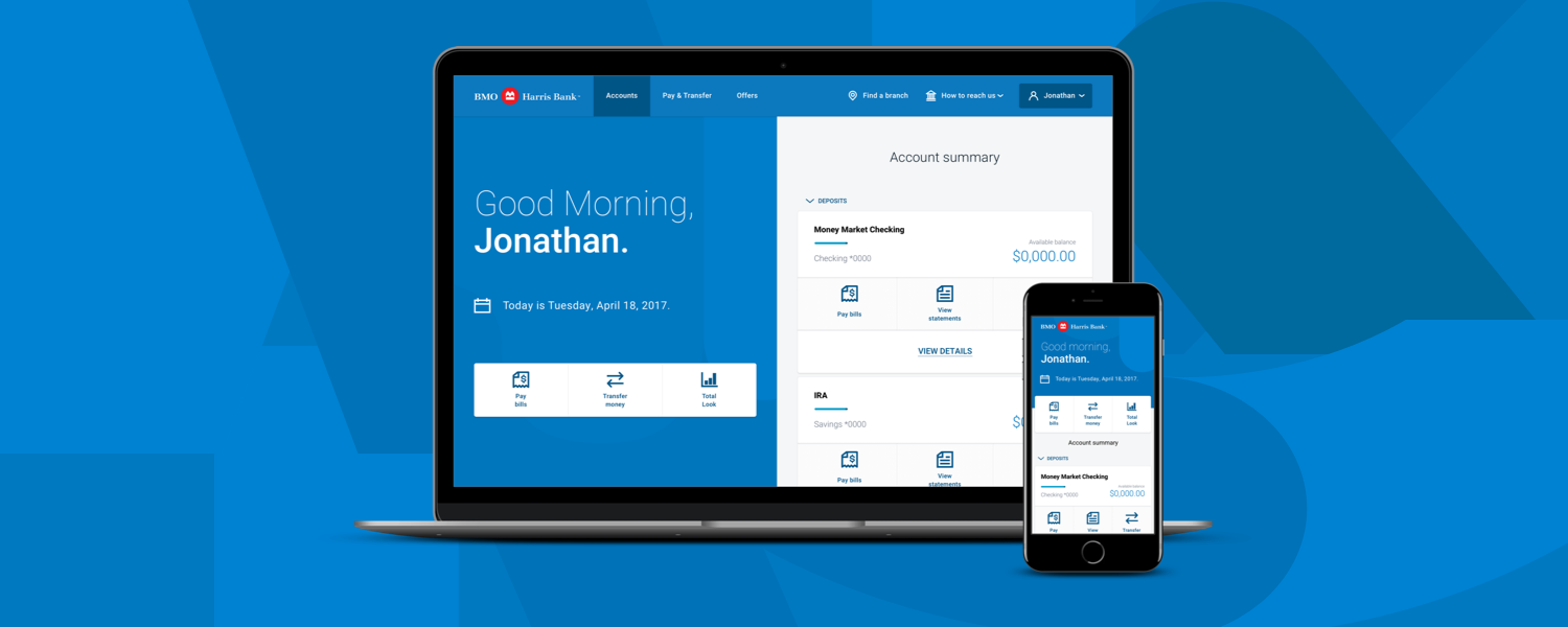
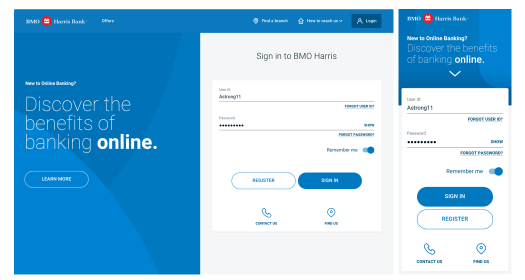
BMO Harris was one of the biggest banks in the North East coast in America. As UI/UX designer and UI developer, my team and I designed 36 different features across five teams on both desktop and mobile platforms.
In that time, I was
able to take leadership in working closely with developers and our clients in fostering trust and open communication with each other in implementing and teaching the importance of design. While still delivering screens for multiple teams
on a specific feature in two weeks and updating previously worked on designs based off of user research/feedback.
I was able to do this by getting buy-in on a new Design QA process, created a Design System, introducing a new design
workflow and a Number System to maintain all our screens.
About 8 months in, the design team was reduced to the size of two. My coworker and I had to support multiple teams while managing relationships with our clients and third
party vendors as we continue to deliver on new designs for our teams on top of our usual responsibilities.
Toxic relationships between Developers and Designers
When I started this project, one of the major issues I identify was the relationship with Designers and Developers, or lack of it. I could hear both team complain with one another while they sat next to one another.
As both a designer and developer, I understood each point of view, and I saw it as an avenue to break down that barrier with one another especially if we were going to work as a team for more than a year.
To do so, I would need to get the trust of my developers. Therefore, whenever I designed a flow, a page, or anything for that matter, I would ask for input from everyone on my team. I wanted developers to help me identify if my designs were
feasible but as well as giving them a voice to my design solutions. I made sure that each of them was able to review my designs before approaching and presenting to my Design Leads and clients for final approval.
OOther people on the team were able to see the change in dynamics, and soon asked me for advice. I shared exactly what I did, and soon later the toxic mentality dissipate. The more invested every stakeholder were in our designs the more likely
they are to put in the extra effort to ensure that our designs came to reality. And when it came to crunch time, we were able to rely on one another, there were times where developers were in solution meetings with clients and when the
subject of design comes up, they would pause the meeting and would say they need to consult one of the designers before moving forward.
Inconsistent Components being Designed and Built: Design Systems
design systems + design ops + design/development
We used Zeplin since the beginning of the project to hand off designs to developers. It was a great tool since it was a single place to find all our designs, generates code and guided product owners to see the overall look and feel.
But there were issues, we couldn’t rely on the tool to generate accurate code every time, and designers might produce inconsistent designs across designers (see above)
Developers were getting frustrated that the designs we delivered were wildly inconsistent and asking us which one was correct. Designers were frustrated that kept on remaking common components hammering their workflow.
It was clear
that a single source of truth was needed for both developers and designers. Proper documentation on both sides that would help mitigate and relive miscommunication with the ability to dynamically update and adapt as we continued to build/design
the platform.
The design system was created so that developers don’t have to spend so much time rebuilding the same button over and over again. And the designers spending less on how a button should look like or where is the latest button style is and focus on design
decisions. .
Every component is designed and developed with responsive in mind. With definition on how it was spec-ed out. A Token System was rolled out at the same time, it helps mitigate changes in the future, since everything is a variable and built
in variables it allows for us to handle changes swiftly and without impacting people’s workflow.
On the development side, I would manage and create the entire master SCSS file. Everything is variable based and therefore if we change a button height in here for example, every button in the platform will change. Developers do not need to worry if their
button is the latest one or not, or what button to use because there is only one button and it is always up to date.
On the design side, I managed an entire Stickersheet on the Craft Library. Designers can just drag and drop components on to Sketch, ensured that what they are using are exactly what they are going to get in Production and that it is always
the latest component.
Every component, on the website, CSS and Craft Library was managed by me and I had one CSS developer to ensure that none of the other developers were able to touch the core CSS code to ensure that both sides
were in sync.
“The goal for the design system is to create a unified, cohesive experience between all platforms and all screen sizes. A systematic design will create and guide designers, developers and shareholders into one look and feel. The system is
the foundation and is the first step for all design problems and solutions. It is a blueprint for how every component, style, colour, animation work into one cohesive look. The system might not always be a solution for every encompassing
component but it should always be a starting point on where the solution should be heading.”
- Mission Statement of the Design System
Sharing Files with one another
design ops
The Design System ensured that components, atoms and molecules (http://bradfrost.com/blog/post/atomic-web-design/) were consistent throughout the platform, but
how could you ensure that the entire experience is consistent? If one designer is working on Transfers and another is working on Scheduled Transfers, the two should look similar, but how can we ensure that two experience is consistent?
Zeplin could be a place to see what the other team/designer is doing but it would be hard when we don’t have the source file.
“Can I have a copy of your latest file?” “Who has the latest file for X?” “Who opened my file on the Google Drive and now its corrupted?!” - were common among our design team.
Sketch Version Control was just started to become a tool
and most were in their Beta stages. We ended up with using Github Enterprise, I taught and outlined steps for every designer on how to use the tool.
Whenever there were conflicts with files, I would handle them and having the ability to roll back on older versions of the files.
As long as each designer, remembered to commit their latest designs and retrieve each other’s design.
We all were able to have a copy of the latest work from one another, without breaking each other’s workflow, without changing each other’s file unintentionally.
To this day multiple design projects in our company are trying to adopt this methodology to ensure asynchronicity across the design team.
Developers creating pages that do not match the design: Design QA
design ops
A final piece for complete end-to-end Design operations was making sure that the pages that our developers made, looks like what we designed as. I do not expect our developers or our QA testers to have an eye for pixel perfectness.
To ensure this, we implemented a new process, early on in the project to QA screens right before we can send it off to our client for final approval and work completed.
This helps relieve the stress of both QA Testers that they have to catch all the Design Bugs, while trying to ensure the functionality of the page is still working. For Designers, are able to sign off and see the final product and gives us
an opportunity to talk to our developers when things don’t match up. For Developers, they have an opportunity to work with the designers and be able to understand the errors and potentially avoid them all together. For clients, we they
can trust that what the design team proposed would be exactly what they expect to see at the end.
Maintaining our bigger and bigger catalog of screens: Number System
design ops
With each new sprint, we had a new Zeplin project. Which means links can be completely be outdated in Jira in a matter of two weeks.
To ensure that each screen can be called back at a later date. A numbering system was needed to not only ensure the screen was easily called back on a different project, but as well as being easy to track, audit and sorted.
The number system is broken down to “X.Y.Z;a”
X: This is the major feature name
Y: Used for sub-features - Useful when you have a decision tree
Z: The last dot number would usually be the screen number in the flow starting
with zero
;a
The semicolon is a way to separate for the same page but in different conditions. Esp useful when you have to show error states.
This ensures that every feature, flow, screen, on desktop and mobile is accounted for. That can be easily referenced. For every stakeholder it means the ability to refer to a screen with “8.3.1.1;3M” instead of “Preferences - User Preferences
- Change UserID - Error Taken - Mobile”
Details:
Project: BMO Harris Online Banking Redesign
Applications Used: Sketch, Illustrator, Github, Zeplin
Technology Used: HTML, CSS, Token System, Material Design Components


